

Introduction
Few garments in contemporary fashion carry as much conceptual weight as the Vetements hoodie. What began as a simple, unbranded black hoodie from a small Paris-based collective in 2014 grew into one of the defining symbols of the oversized streetwear movement that reshaped luxury fashion over the following decade. Founded by Georgian-born designer Demna Gvasalia alongside his brother Guram, Vetements built its identity on deconstruction, irony, and an unapologetic embrace of exaggerated proportion. The brand’s hoodies — often oversized to the point of swallowing the body, sometimes stamped with corporate-style branding or satirical graphics — became a kind of uniform for a generation of fashion insiders and streetwear enthusiasts who wanted clothing that felt disruptive rather than decorative.
But beyond its cultural provocations and headline-grabbing runway stunts, the enduring appeal of the Vetements Clothing lies in something more fundamental to clothing design: the interplay of texture and proportion. This essay examines how Vetements uses these two elements to construct a distinct visual language, and how that language can be translated into practical, wearable styling — for anyone looking to understand not just what makes a Vetements hoodie recognizable, but how to actually wear one well.
The Foundations of the Vetements Aesthetic
To understand how texture and proportion function in a Vetements hoodie, it helps to understand where the brand came from. Vetements emerged not as a traditional fashion house but as a design collective, drawing several of its early members from Antwerp’s Royal Academy of Fine Arts — an institution known for producing designers who challenge conventional silhouettes and construction methods. Demna Gvasalia had already spent time at Maison Martin Margiela, a house famous for deconstruction, and at Louis Vuitton, giving him both an instinct for conceptual reinvention and the technical grounding of high fashion.
This combination shaped Vetements’ early identity: clothing that looked almost accidental — oversized, asymmetrical, occasionally referencing secondhand or thrifted garments — but was in fact meticulously constructed. The hoodie became an ideal canvas for this philosophy. It’s a garment with deep roots in utility and streetwear, historically unpretentious, which made it the perfect object for a brand interested in elevating the mundane into something with real fashion weight.
Proportion as the Defining Signature
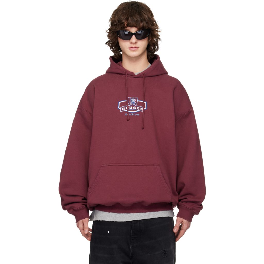
If there’s one element that immediately identifies a Vetements hoodie, it’s scale. The brand popularized an exaggerated, oversized silhouette long before “oversized streetwear” became a mainstream category — sleeves that extend well past the wrist, shoulders that drop far past their natural line, and body lengths that hang loosely over the hips rather than sitting close to the torso. This wasn’t oversizing for comfort alone; it was oversizing as a design statement, deliberately distorting the expected proportions of a basic garment to create visual drama out of something ordinarily unremarkable.
Styling around this kind of proportion requires a different approach than styling a standard, fitted hoodie. The exaggerated scale works best when the rest of an outfit provides some kind of counterbalance — a slimmer trouser or a more fitted bottom layer, for instance, which keeps the oversized top from overwhelming the entire silhouette. Vetements’ own runway presentations often played with this balance directly, pairing dramatically oversized tops with narrow bottoms, or layering multiple oversized pieces together in a way that created its own internal proportion logic rather than following traditional fit rules.
For anyone styling a Vetements hoodie outside the runway context, that same principle holds: proportion contrast is what keeps an oversized piece looking intentional rather than simply large. Pairing an oversized hoodie with equally loose, baggy bottoms can quickly read as shapeless, whereas contrasting the volume up top with something more fitted below preserves the silhouette’s visual structure.
Texture as a Layer of Meaning
Where proportion gives the Vetements hoodie its immediate visual impact, texture is what gives it depth. The brand has never relied purely on silhouette; its hoodies frequently incorporate heavyweight cotton fleece with a raw, slightly unfinished quality, exposed seams, and construction details that intentionally reference the imperfection of secondhand or altered clothing. This textural roughness works in direct conversation with the brand’s broader ethos — an aesthetic built on re imagining and contextualising everyday garments rather than presenting flawless, factory-clean design.
Texture also plays a role in how Vetements pieces interact with branding and graphics. Some of the brand’s most recognizable hoodies incorporate bold, oversized text or corporate-style logos — a strategy that turns typography itself into a textural and visual element rather than simple decoration. The scale and placement of these graphics often mirror the exaggerated proportions of the garment itself, reinforcing the sense that everything about the piece, from cut to surface detail, has been deliberately inflated beyond its ordinary scale.
When styling around texture, the goal is generally contrast rather than uniformity. A heavyweight, raw-textured Vetements Hoodie paired with smoother, more structured pieces — a leather jacket, tailored trousers, or sleek footwear — creates tension that highlights the hoodie’s tactile qualities rather than letting it blend into a uniformly casual outfit. This mirrors a broader technique used throughout high-fashion streetwear: using unexpected textural pairings to elevate otherwise casual pieces into something with more visual sophistication.
Layering as a Styling Strategy
Because Vetements hoodies are cut with so much extra volume, they function exceptionally well as layering pieces — both under and over other garments. A common approach seen throughout the brand’s own presentations involves layering an oversized hoodie underneath a fitted or structured outer layer, allowing the hoodie’s hem, sleeves, or hood to peek out and disrupt the cleaner lines of the piece worn on top. This creates a visual layering effect that plays directly into the label’s interest in contrast — soft, oversized volume set against something more rigid and tailored.
Alternatively, the hoodie can serve as the outer layer itself, worn over a simpler base layer like a T-shirt or long-sleeve top, allowing its oversized proportions to dominate the overall silhouette. In this configuration, keeping accessories and additional layers minimal tends to work best, letting the scale of the hoodie itself carry the outfit’s visual weight rather than competing with it.
Color and Graphic Placement
While proportion and texture form the structural backbone of Vetements’ hoodie designs, color and graphic placement add another dimension worth considering when styling these pieces. Much of the brand’s output favors a relatively restrained color palette — black, grey, navy, and muted earth tones — which allows the exaggerated silhouette and textural details to remain the primary focus rather than competing with bold color choices. When graphics or branding do appear, they’re often oversized and centrally placed, functioning almost like an architectural element within the garment’s overall composition rather than a subtle accent.
This approach to color and graphic scale suggests a broader styling principle: with a piece this visually loud in terms of proportion, restraint elsewhere in an outfit tends to serve the garment better than competing embellishment. Simpler color palettes, minimal additional branding, and clean supporting pieces allow the hoodie’s own exaggerated scale and texture to remain the outfit’s clear focal point.
The Broader Influence
It’s worth noting that the design language Vetements pioneered with its hoodies didn’t stay contained within the brand itself. The oversized, deconstructed aesthetic the label popularized in the mid-2010s rippled outward across both streetwear and luxury fashion, influencing everything from mass-market hoodie silhouettes to high-end collaborations with brands like Reebok, Levi’s, and Champion. Understanding how Vetements approaches texture and proportion, then, offers insight not just into one brand’s design philosophy, but into a broader shift in how oversized silhouettes came to be treated as a legitimate, considered design choice rather than simply a matter of casual comfort.
Conclusion
The Vetements hoodie endures as a reference point in contemporary fashion not simply because of its cultural notoriety, but because of the specific design logic underlying it: proportion pushed deliberately past convention, texture used as a means of adding depth and narrative, and both elements combined to transform a historically humble garment into a piece capable of carrying real fashion weight. Styling it successfully means understanding that logic rather than working against it — using contrast in fit, texture, and color to let the hoodie’s exaggerated scale read as intentional rather than incidental. In doing so, the Vetements hoodie becomes more than a streetwear staple; it becomes a study in how proportion and texture, handled with intention, can turn even the most ordinary garment into a genuine design statement. Read More….